Case Study - Animation
A series of 90-second animations to communicate the research and findings from the Institute for Molecular Science and Engineering’s recent briefing pages.

The project:
We were tasked with producing a series of 90 second informational motion graphic animations for the Institute for Molecular Science and Engineering (IMSE) at Imperial College London.
The client approached us following some animation work we had recently completed for the Grantham Institute for Climate Change: another research institute based out of Imperial College London.
IMSE specified that they would like to start with two animations focused on the findings they had outlined in some recent briefing papers covering a range of highly technical and scientific topics. Stylistically, the videos had to match that of the Grantham Institute animations. They needed to be informative but accessible to the layman. Design-wise, as usual, the client’s colour palette, fonts and logo had to be taken into account. There were also a number of scientific figures within the briefing papers that had to be adapted for the animation. The designs would have to factor these figures in when coming up with new concepts. Other aspects, like narration, music and sound design would need to match the aesthetic of the Grantham Institute animation series.
Our approach
Pre-production
We began by having an informal chat with the key project stakeholders to establish specifically what they liked about the Grantham Institute for Climate Change animations and potentially what they would like to replicate within this series. We had a discussion about how the institutes differ in remit and research interests in order to begin to understand how we might adapt the production for multiple audiences.
During initial discussions, we took some time to establish the preferred modes of communication throughout the project. We agreed that we would use Trello and email, involving the commissioning team during each stage of production. Trello would be used additionally as a tool to provide the client with artistic concepts and options for decisions on elements such as voiceover artists and music tracks.
Script development
We were fortunate that we received headlines for the briefing papers which are a good starting point for the narrated component of the animation. We had decided with the client that the animations would be narration-led with the visuals emphasising the spoken content. The key here for us was to develop scripts that included as much information and as many of the research findings as we could in a relatively short time frame of 90 seconds. For the narration, we settled on a pretty quick word count of 160 words per minute (with a total of 240 words per script) to convey a good quantity of information without rushing or overwhelming our audiences.
The scripts were developed collaboratively along with the relevant research teams and briefing paper authors to ensure scientific accuracy.
At this point, given the technical nature of the projects, we recorded additional guide voiceover tracks to demonstrate how the scripts would eventually ‘sound’ for the final video. This helped to inform a few changes. Often we find that a script needs to be heard before it can be approved.
Storyboard and style frames
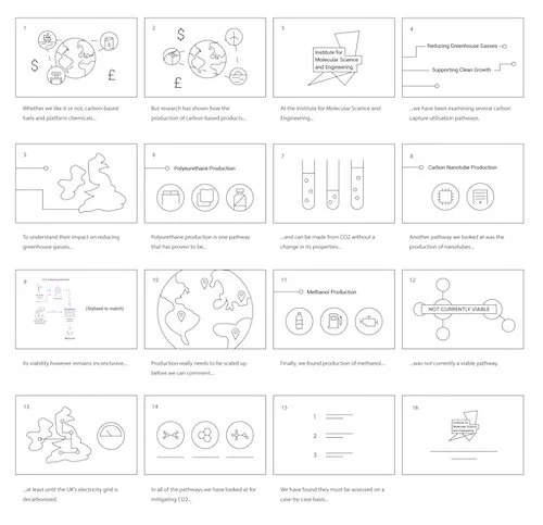
Once the scripts had been approved, we were in a better position to start thinking about how some of the visual aspects of the animation might come together. As discussed we had to bear the existing visual identity and scientific figures in mind when coming up with visual concepts. Again, we were required to consult the papers’ authors to ensure that our visual concepts accurately depicted the ideas that were being communicated.
These rough storyboards were hand-drawn and then scanned so they could be sent in a digital format. Gradually we were able to digitise the sketches in order to start creating higher-fidelity renderings of the artwork.
Illustration
The next stage, once the project team had approved the storyboard, was to begin developing the vector artwork in Adobe Illustrator. Again, referring to the existing visual identity, we were able to develop a unique look and feel that gave the visual concepts life but appeared as if they ‘belonged’ with the rest of the IMSE brand.
We established a flat illustrative style using 'blobs' throughout all animations for stylistic continuity, acting as a backdrop or mask for certain scenes, animated elements and focal points. This style allowed us to convey a complex subject matter in a concise, digestible format and balance the necessary scientific detail with clear illustrated visuals.
Voiceover
In the elicitation sessions, we agreed that the voiceover narration, above all, should have the following characteristics:
Authoritative but warm;
Dynamic but calm;
Articulate but relatable.
After finding and providing several viable options we found voiceover artists to perform the script for the videos. In order to give clear directions on timings and pronunciation, we provided a guideline voiceover track. Fortunately, the authors and research team were able to consult on the pronunciation on the more specialist language within the script.
Music and sound design
We wanted the tracks to have quite serious undertones whilst retaining a ‘playful’ element. The length of the music tracks we acquired had to be edited in Adobe Audition in order to match the 90-second duration of the video.
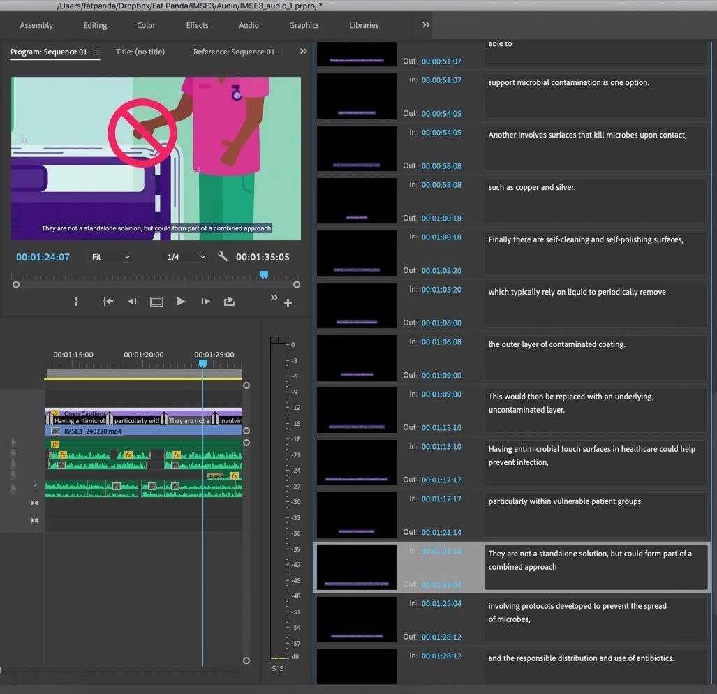
The sound design bed was fairly minimal for both animated videos. Hyperrealistic Foley was used to augment the on-screen visual elements. Sound design was created and then edited using Adobe Premiere using some minimal processing and effects in order to achieve an experience that felt hyperreal while, at the same time, very organic.
Again, we had an established a style that we were able to reference for the audio aspects of the production. The music in the Grantham Institute animations had quite a whimsical feel with marimba/pizzicato string-type instrumentation. One of the key phrases we searched for when looking on stock sites was ‘documentary’ music. We really wanted music that bubbled away nicely in the background without being too distracting.
Motion design
We took care at the animation stage to ensure all kinetic typography and character animation was smooth and fluid, each scene flowing effortlessly into the next with exaggerated easing adhering to Google's Material Design principals for speed and motion.
We were in regular contact with the commissioning team throughout this process to ensure our work was aligned with the client’s artistic vision. This helped to avoid any big surprises or amends at the end of production.
Before even touching Adobe After Effects, for the animation part of the production, it was important we were 100% sure that the illustrated visual content worked within the context and timing of the voiceover. We therefore created a guide voiceover and animated to this before commissioning the professional narration.
Careful layering of artwork helped to streamline the motion design process. All files and comps would be appropriately structured to make the animation much easier and quicker to work with. This layering system also helped with the 2.5D and 3D elements when exporting to Cinema 4D.
Final editing and subtitles
Adobe Premiere was used again at the end to bring all of the component parts together including the rendered animation, music, professional voiceover and sound design. Premiere gives us the opportunity to do one final check to make sure all component parts are working in harmony. This stage also provides a good opportunity to make any last minute tweaks.
There is an additional opportunity during this phase to produce the subtitles for the animation. Typically, clients will request versions both with and without subtitles with an accompanying .srt file for when videos are being uploaded to YouTube or social.
Once that stage is complete, all that’s left is for us to send the final versions over to the client, making any final small tweaks if required. We usually find there aren’t too many amends at this stage, particularly if we have been in regular contact with project teams throughout production.
In conclusion:
This project, in collaboration with Imperial College London, provided ample opportunity to utilise our varied skills. Despite the relatively short turnaround of 4 weeks per animation, we were proud to have produced a series of portfolio-worthy animations that have led to us receiving more work from the client. The benefit of working closely with the client from the outset is that we now have an established style in place that will be easy to replicate for subsequent videos; also reducing lead times.
So far these videos have only been used for internal purposes, however, we look forward to evaluating how these resources perform on social media and how they are received by the wider general public.

“The team have been invaluable in communicating the often complex findings of our academic research to the general public in an easy-to-understand, engaging format.
They’ve been a pleasure to work with, combining impressive attention to detail with an accommodating approach, we couldn’t recommend highly enough.”
Dr Kieran Brophy
Communications Manager, Imperial College London


